jealous that my daughter went to moma and saw starry night, I pulled out my van gogh book. starry night wasn’t even in the book!
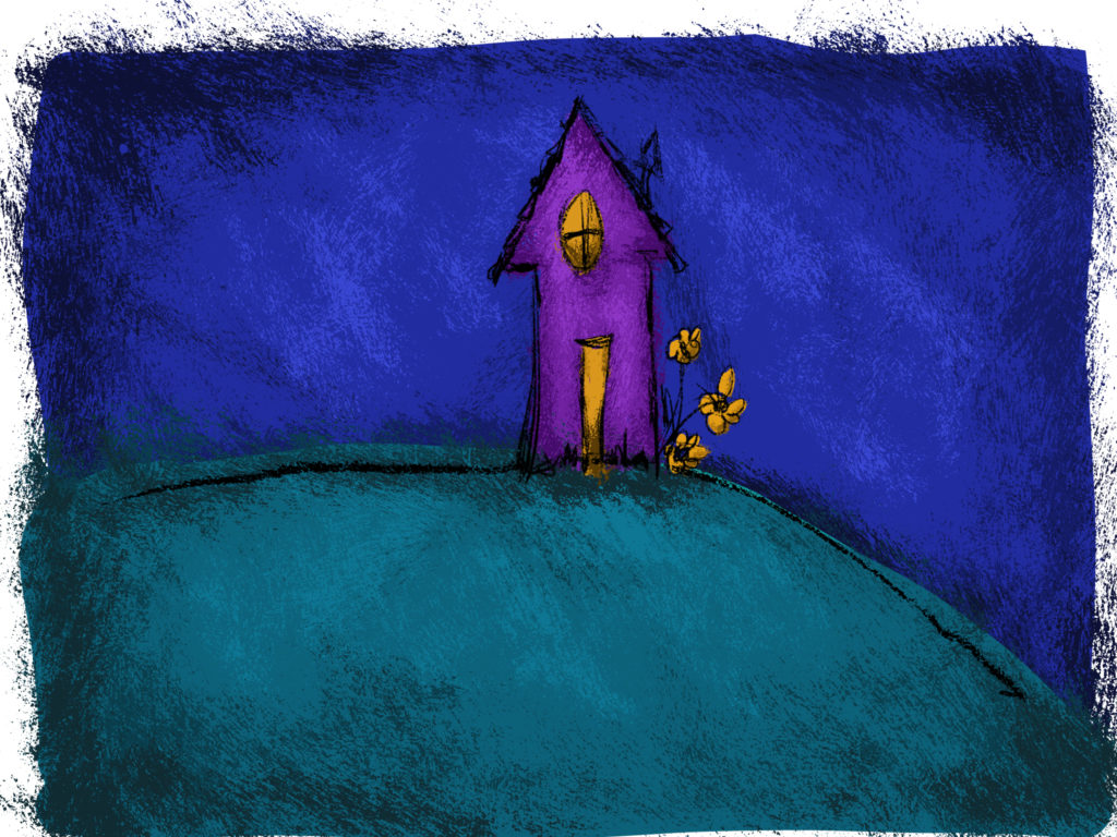
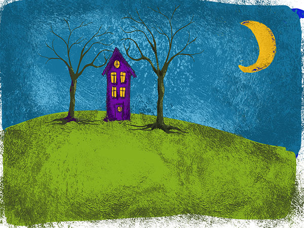
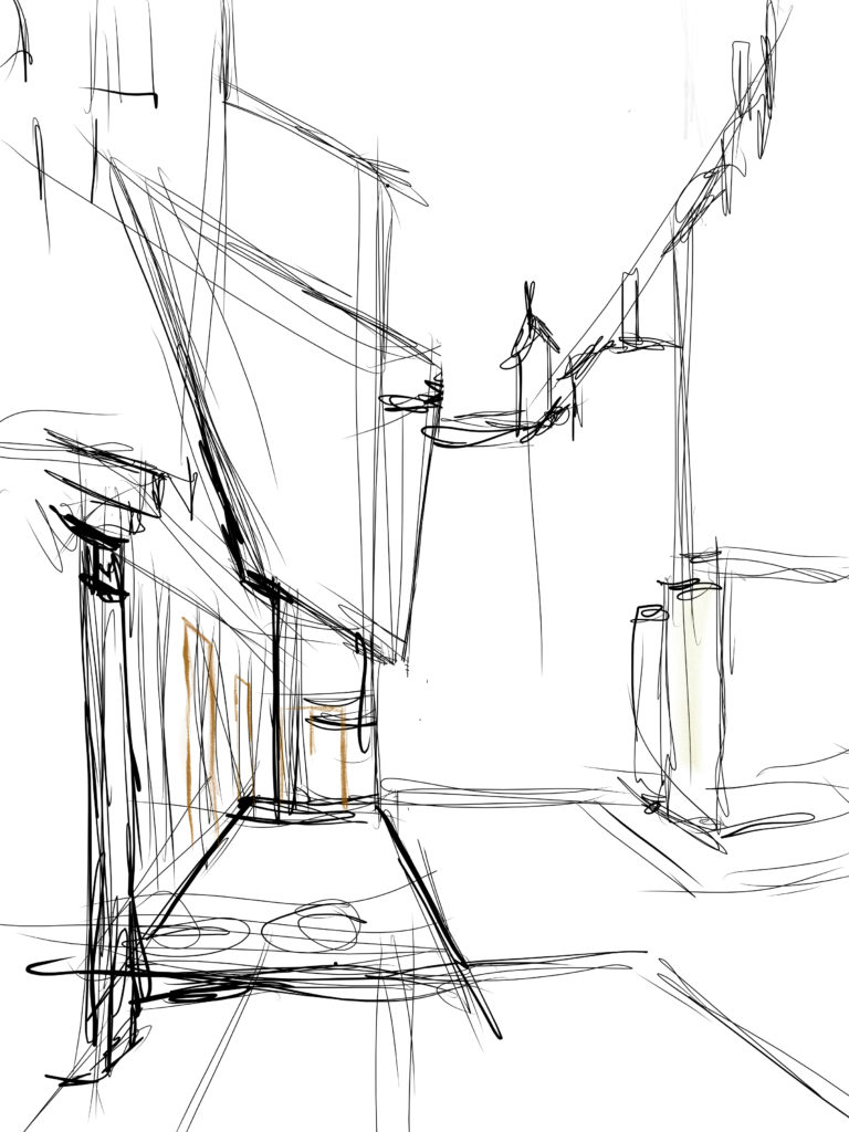
having left the book on the coffee table, it inspired a new drawing on the ipad. what can i learn from vincent? at first glance, looks like it would be fun to try and replicate some of the brush strokes.
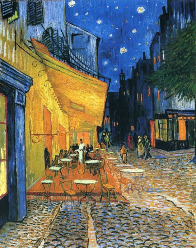
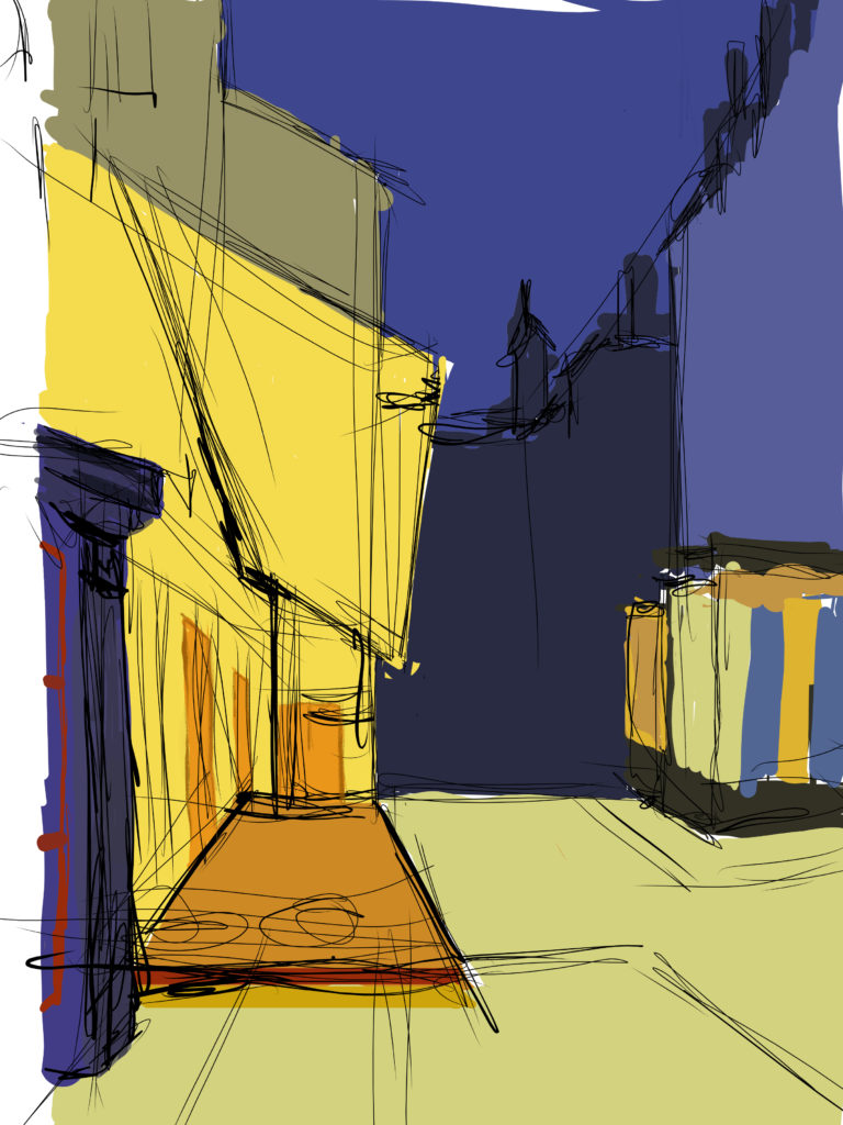
while adding blocks of color, i noticed how limited the pallet is. not in a bad way! i had an amazing color class in my undergraduate studies at uw-madison. one project was replicating a famous artist’s work with the idea that many artist limit their pallet to three main colors. looking closely at the original art, you might say that there are just two here, blue and orange. and you can’t ignore the juxtaposition of complimentary colors. no wonder the cafe lights glow.
at this point, you also have to acknowledge the fact that van gogh completely disregarded realistic color. look at the orange windows on the right side. where would you ever see that in reality? but by adding them, he repeats the orange from the left side of the painting and creates harmonious color. using small amounts of orange on the right, the focus stays on the cafe, but eventually draws your eye to the right to take in other details–for example, their vertical lines guide your eyes down to the people walking in the street.
i’m rambling now.
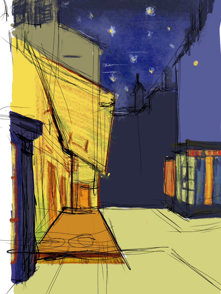
at this point, i’ve stopped thinking about the brush strokes. i’m noticing the secondary colors: green and red. fresco does an amazing job of allowing layering and transparency to create a mixture of colors.
now if you go back to the original and break it down… wow. blues and oranges everywhere. genius.