side tables : update

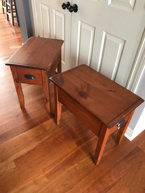
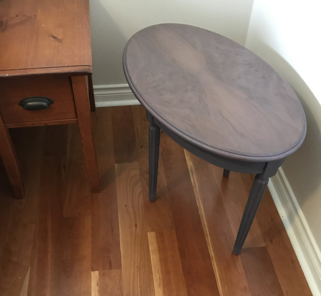
These tables were twenty years old, scratched and much darker than I wanted. Being solid wood, I was able to sand the tops. In the end, I’d like to see the wood grain.

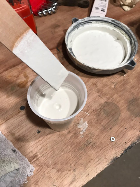
Homemade chalk paint worked easily on the lower parts. I always wash with trisodium phosphate to remove dirt and grease, rinse well and let dry before painting. Here is a recipe from Lowes. Basically, mix 1/3 cup of Plaster of Paris and 1/3 cup of cool water; stir until completely smooth. Mix that with 1 cup of latex paint and stir thoroughly. This will make enough chalk-finish paint for one coat on a six-drawer dresser.

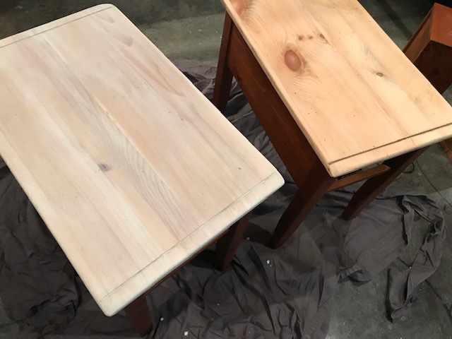
Once that was done, I watered down some of the chalk paint until it was as thin as milk. I used this thin was as a stain for the top. Depending on how thin your stain is determines how many coats you want. Just keep adding layers of stain if you want more color or create a thicker stain.

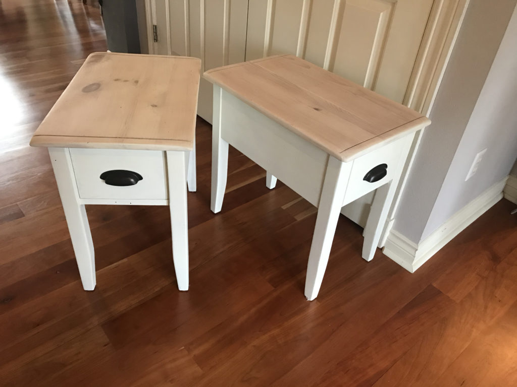
After drying for a couple days, I rubbed and buffed 3-4 coats of Minwax Paste Finishing Wax. One might think that an acrylic polyurethane would work well, but it didn’t for me. Although all instructions and research indicated it was safe, the surface of my dining room table had to be refinished because the acrylic polyurethane made the chalk paint bubble and peel off! After that, I never used anything but wax. Rub the wax on generously and leave for ten minutes. Buff. Repeat 2-3 more times.

This small oval table was found at St. Vincent DePauls. One leg was wobbly and the top had many water stains. But the wood grain was beautiful. I really like how the purple/gray paint looks, especially with the wood grain.

rooster

I’m excited about this little guy… it took some work to make him look happy with a beak. He needs a little more work, but I’m happy with how he’s developed.

c hearts

for several months, my family and I have been struggling with news that my sister has pancreatic cancer. it’s devastating. we cling to hope.

a few weeks ago, i was on a mission in my studio. i started to make c hearts. (cathy hearts) it was a strong desire to have something to hold… hold the hope, hold the heart, hold my sister. that day, i spent 7 hours straight sawing, filing, hammering, soldering and polishing.

holiday lights

I pulled out the strings of holiday lights only to find out that some were chewed by critters. I did not want to purchase another string of lights–and condone adding more plastics to our world.

Looking through the house I found a number of vases, jars, and candle holders. I went to St. Vinneys to get a few more along with orphaned candle stubs. The candles I found at Vinney’s were knicked, ugly, and some were used. But it didn’t matter. They were perfect for my holiday lights. I gave them purpose.

I lined them up on the porch railing and burned the candles for a few hours each night. Beautiful!

cafe terrace at night, van gogh, 1888

jealous that my daughter went to moma and saw starry night, I pulled out my van gogh book. starry night wasn’t even in the book!

having left the book on the coffee table, it inspired a new drawing on the ipad. what can i learn from vincent? at first glance, looks like it would be fun to try and replicate some of the brush strokes.

cafe terrace at night by vincent van gogh 1888
i started with a sketch of the basic forms.
while adding blocks of color, i noticed how limited the pallet is.

while adding blocks of color, i noticed how limited the pallet is. not in a bad way! i had an amazing color class in my undergraduate studies at uw-madison. one project was replicating a famous artist’s work with the idea that many artist limit their pallet to three main colors. looking closely at the original art, you might say that there are just two here, blue and orange. and you can’t ignore the juxtaposition of complimentary colors. no wonder the cafe lights glow.

at this point, you also have to acknowledge the fact that van gogh completely disregarded realistic color. look at the orange windows on the right side. where would you ever see that in reality? but by adding them, he repeats the orange from the left side of the painting and creates harmonious color. using small amounts of orange on the right, the focus stays on the cafe, but eventually draws your eye to the right to take in other details–for example, their vertical lines guide your eyes down to the people walking in the street.

i’m rambling now.

at this point, i’ve stopped thinking about the brush strokes. i’m noticing the secondary colors: green and red. fresco does an amazing job of allowing layering and transparency to create a mixture of colors.

now if you go back to the original and break it down… wow. blues and oranges everywhere. genius.

adobe fresco

while starting up adobe draw, i was invited to try fresco. great. I wouldn’t have known about it without an invitation. it’s sort of a mini version of photoshop–but so much more. it combines vector art with raster-based art which are separated by the layers and the tools used to create them.

i quickly learned to draw large blocks of solid color with the vector layers and then add texture and shading with the raster (pixel) layers.
the trees were drawn as vector art. another layer of pixel art adds shading and texture.

new ipad

my amazing significant other, tim, had the brilliant idea to surprise me with a new ipad with pen capabilities. I have not been able to put it down. i’m impressed with the pressure sensitivity.

playing around, i appreciated the ability to zoom in for infinite detail.

wow.. and the brushes available are endless. all vector art.

sweet potato brownies

sounded really good and healthy. the batter tasted like chocolate sweet potatoes–go figure. So before baking, i added some brown sugar, vanilla, an egg and gluten free flour.  i did eventually eat the whole pan–so they weren’t too bad.